Hopper
A case study for Hopper Mobile iOS app
This is a case study as part of a home task to look into Hopper app, analyse and investigate three key pain points in order to showcase my process and approach.
The Hopper app has helped over 70 million travellers find and secure the best price on flights, hotels, homes and car rentals - each and every time they book their trips - saving its users an average of $65 per trip compared to other travel booking sites or apps.

Project Check
Tools: Figma
Team: Myself
My Role: UX design, UX research, UI/Visual Design
Timeline: Overall: 9 hours (including research)
Overview
There are many reasons why businesses might want to change a product’s experience. However, it’s crucial to start this process with a good understanding of the problems you’re trying to solve. I was given a choice of one out of three apps (Hopper, TripAdvisor, Booking.com) to propose improvements or enhancements, based on 3 pain points I will discover. The only constraint was that I have to look only at the mobile app and my timeline was apx 10 hours.
The reason for my choice came down to two key areas:
Hopper is the “youngest” (newest) out of the three services. It was founded in April 2007 by two former executives from the Expedia Group and started as a travel planning tool before expanding to bookings. Being the most recent out of the three services also reflects on it’s maturity of possible issues and pain points to be improved.
It has a fairly low rating on TrustPilot. Although not the lowest rating out of the three, the low ratings provide some insights (reviews) as to what users find as issues or frustrations with the services, thus allowing me to create, explore and analyse some scenarios that would reflect a real-life situation.
The Challenge
My challenge was to propose improvements or enhancements, based on 3 pain points I will discover.
The Key Goals of the project:
Discover pain points
Craft the problem statements
Propose improvements
Design a set of solutions
Present and discuss those with a team.
Notice: Regardless of how much effort is put in this case study, designing it right and designing the right things with limited time and information, it will not give it the appropriate justice. In order for any UX project to achieve the best results, one would require access to the core team, technologists, existing or in-depth research, business value proposition etc. This would require appropriate resources, time and insider information that are impossible to obtain as an outsider as well as within the specific timeframes.
My Design Process
This process does not reflect every scenario, and is confined within the limitation as outlined on the brief and timelines/deadline.
So here is the process I decided to follow:
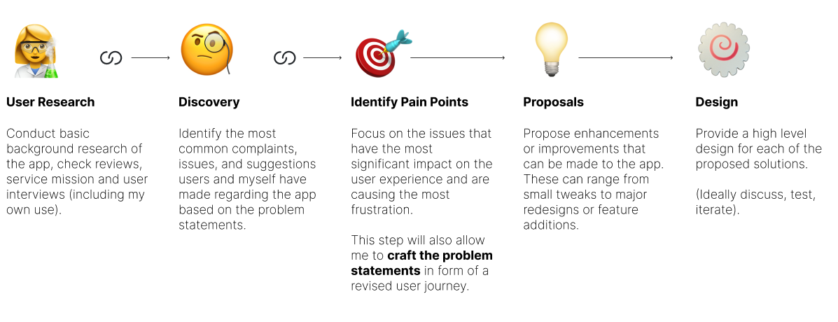
User Research
My research* included the following:
* - refers to a non-extentive background search, reviews, and app information based on Apple iOS
There are many ways one can approach a task with limited information and timelines. The brief outlines the need for the discovery of pain points I will discover while using the app. Even so, my own use of the app and finding pain points leans biased to my knowledge of experience patterns, therefore I always look at apps from a slightly different perspective - a designer’s view - which inevitably can lead towards pain points that actual users may not see or see differently - i.e. a user-centric view.
In order to eliminate the subjectivity of this I decided to divert (just a little) from the brief, and use some basic research practices in order to get a more holistic opinion and view on the app. This will not be extensive and I will still remain the key decision maker on what pain points I also discover in order to better inform the decisions I will be making in the proposal and design phase.
My research can be outlined as follows:
Pre-Solution
Basic online search of the app / information about the company & app store reviews / competitor review
Create a user scenario reflecting basic workflows
Interview 3 (+myself - put in the shoes of a user) users with similar characteristics - no more than 10 min each
Post-Solution
Usability of solutions on the same users - gather further feedback.
Research
First and foremost I became familiar with the Hopper App. I downloaded the app and explored a few workflows to understand better its use and purpose.
I examined reviews on the app store to get a sense of what users say and feedback. Here are a few interesting comments (note: the screenshots are partial feedback from users and not their entire content).

To be a little more thorough and as best UX practice, I also did a very quick competitor analysis/review, to make sure I have a sense as a designer, what other reputable apps look and feel like and what is there main call to actions and workflows.

I then conducted user interview sessions with 3+1 users (that share similar characteristics defined further in the task) and asked them to go through the hopper app and explore a basic journey (plan a trip to your favourite destination).
From a larger number of feedback I captured the following comments:

User Scenario (A revised journey)
When I interviewed my users and myself, there was no real focus on a specific journey. It was more of a free-for-all type of exercise to see how generally someone would use the app.
i.e. Plan a trip to your favourite destination.
In order to move more efficiently to the next phases (discovery, proposal, design/user-testing and further feedback) I revised a user scenario to reflect better the groups of users and retain a more focused approach.
The revised user scenario reads as follows:
As a couple between the age of 35yo to 45yo with one child, I would like to find, and book a complete holiday, that it would include flights, hotel and car rental.
The good news is that the couple has a good budget in mind after saving for a few months, however they are very keen to stick to that budget and not go over it, and would like to find good prices. As they have a child, comfort on hotel/flights and finding the best prices is important.
Their main goal is to find good locations, the best prices but also be very efficient on how much it will all cost and not surpassing their budget before they book or reserve anything. Everything has to be timed perfectly. So the planning part of their trip is as important as the trip itself.
Discovery
Through the research and the use of the app, I made the decision to hierarchically outline my discovery in three sections:
User Experience (workflows)
User Interface (UI/Visual Design)
Service (Additional Enhancements)
! icon = most critical/quick wins

Pain Points (Crafting the Problem Statements)
By this stage, I started crafting the problem statements based on the research I conducted. I am using a very basic statement that I believe captures a more accurate representation of the problem and gives it a narrower view to explore the solutions I wish to tackle during the proposal of enhancements and design phase.
The simple statement I will follow aims to clearly identify the type of user, the expected action and the reason for that action.
As a [TYPE OF USER], I expect to [ACTION]
because/so that [REASON FOR ACTION].
Here are the three pain point problem statements I will be focusing on:

💡️ Proposal - #1 (as per first problem statement)
This first pain point / problem statement is relative to interpretation. Although the app uses some common patterns for searching flights, hotels etc, while competitors use some kind of similar experience, it is not clear how to start a search if you have an unknown and just want to search for a destination.
As a first time user you may not want to book straight away, but just start finding out places. The workflow here also poses some interesting challengers. In order for a user to book everything they require to go through each item separately.
Although this sometimes makes sense, this could be revert so the choice can happen post-search of destinations and dates.

The way I decided to solve this was to simplify the home screen to start with a search and then give further options. I would not disregard the individual options for each item to satisfy a wider range of user scenarios, however I would point to a search first.

💡️ Proposal - #2 (as per second problem statement)
Addressing the second pain point was relatively straightforward. On the date-selection screen, users were becoming perplexed about the purpose of the four prominent price indicators at the top. They were initially mistaken, assuming that these were buttons with a specific function, causing them to click on them out of confusion. After a while, they eventually realize that these are not buttons, but rather indicators of the minimum flight price for each day on the calendar.

My following redesign aims to improve the following:
Remove completely one step in the process. The middle screen with only two option selections and a smaller calendar map does not feel necessary especially when you move over to the next screen. It does not really contain any information for the user to make any decision apart from choosing a month.
Change the way the lowest/highest price indicators/legend is shown to the user.

💡️ Proposal - #3 (as per third problem statement)
This pain point was by far the most challenging. The main reason for that is because the model and entire experience are required to change. Modifying steps in the workflow as well as adapt the appropriate UI - this would require more in-depth discussion with a team , propose multiple solutions and find the best balance.
There are no single solutions here, so this is a mere attempt to simplify the process of users that require a holistic view of a trip and plan according both to their preferences and very importantly their budget.
As outlined in the first pain point regarding the quick search, a similar issue is presented here. For this solution I am retaining the proposal from the first pain point but I am doing an analysis on the workflows too.
My first steps was to quickly map the journey to try and book for all three options - in this an example hotel, flight & car), which seemed to be a linear process from start to finish.

Based on the problem statement, a user wishing to quickly search and book all three options at the same time, they would have to repeat more than 6/7 steps within the workflow, potentially not getting the prices they need and/or making mistakes on the exact dates.
The way I decided to solve this was to simplify the home screen as the starting point and then filter and use more options accordingly. Again, I would not disregard the individual options for each item and retain them in order to satisfy a wider range of user scenarios, however I would point to a search first.

User Feedback
As per my original plan, I took my revised screens to the same users to ask for further feedback, and what I concluded was the following:
The users resonated with my problem statements, and the translation between their original review to the revised statements made them realise what they were actually looking for.
They found the revised designs far better from the original experience. The continued having more questions and pain paints that were now beyond those improvements, which means they felt happy and more comfortable with the apps’ new design.
All and all, a better satisfaction and experience on what they needed to do to book.
Personal Retrospective
After finishing this task, I waited a few hours before I sent it over. The main reason for that was because I wanted to reflect on what I did, rethink my process, what I would have done differently etc.
Firstly, I found the challenge really fun. It was great to look at an app (I personally don’t use much) and examine it within the constraints.
Secondly, as a Lead Designer, I sat to think how I would pass that knowledge and process to senior designers to learn. I wanted to be as thorough as I could based on the timelines but also provide this in a form of a story, so anyone that would read this they would understand quickly my key points.
Lastly, I understand I would not finish to all of the above. I would continue to improve this if the need arise. 😎
Would like to see and know more about this case study?